Processes
A process is a graphic explaining the sequence of functions SAFE X3 and integrating links of type tunnel toward these functions.
This feature allows you, by using a visual editor, to describe this process.
It must then attach this process to a thumbnail of the portal or well to a process menu (browser to process).

Prerequisites
Refer to documentation Implementation
Screen management
Header
Fields
The following fields are present on this tab :
|
|
|
| It used to define a name associated with each record. |
Close
Tab Description
Fields
The following fields are present on this tab :
Block number 1
|
| If necessary, an access code associated with the current field of the screen is entered here. |
|
|
Description
|
Close
Tab Drawing
Presentation
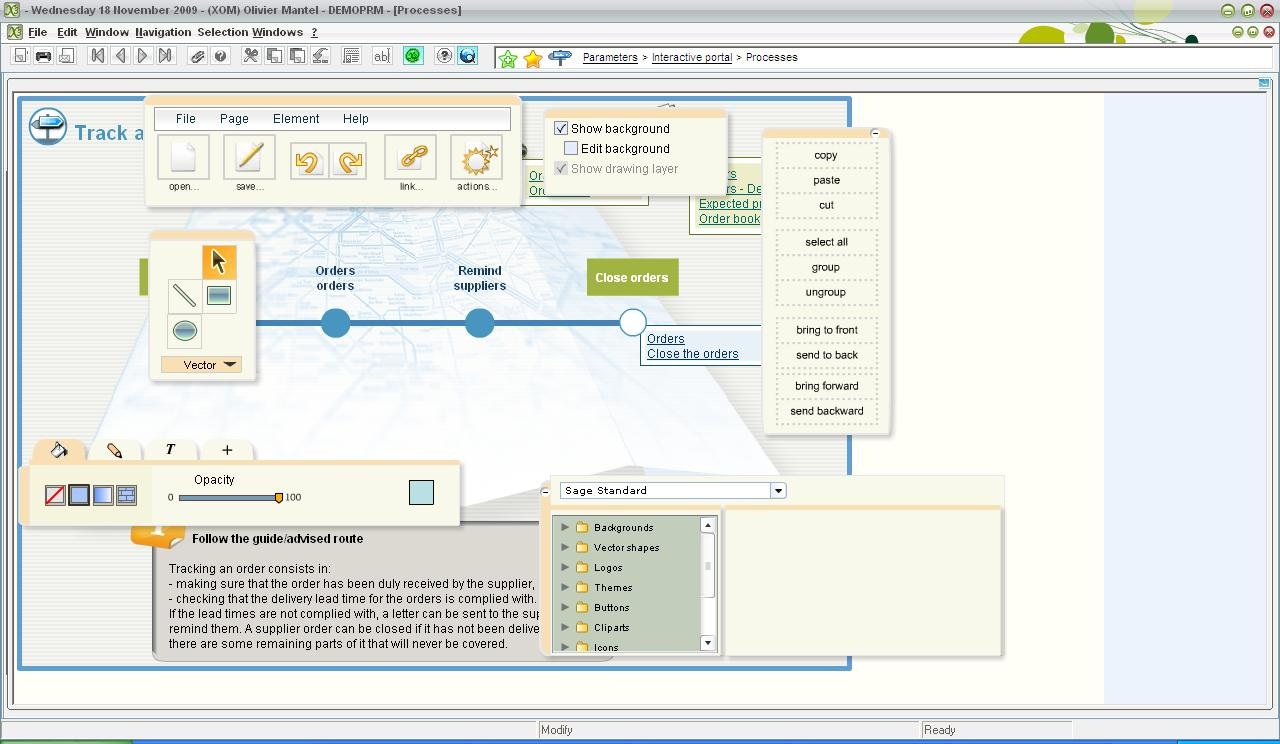
Visual editor for processes

A toolbox
A graphic toolbar

Object | Action |
Arrow | Select the graphic objects |
Segment, circle, full rectangle | Draw these objects |
Pen tip | Add, remove points on curves or segments |
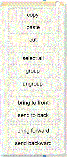
An action bar

Action | Description |
Copy, Paste, Cut | Copy, paste, cut graphic objects |
Select all | Select all graphic objects |
Group | Group the selected objects |
Ungroup | Ungroup the selected objects |
First plan | Put the selected object forwards |
Background | Put the selected object backwards |
Forward | When there are multiple layers of objects, move up to another layer |
Backward | When there are multiple layers of objects, move down to another layer |
A layout area for text & graphic objects

A varied toolbar

Action | Description |
File / Save(local) | Saves the process locally. A process is identified by a memorized code. |
File / Open(local) | Opens the process saved locally by reminding the code saved. |
File / Export into text | A list describing the elements of the process (flash) appears in the opened window. You need to copy this structure that can be read by another program. |
File / Import | You can paste the source of a process (flash) retrieved with the 'File/Export to text' function in the opened window. |
Page / See the limits | Allows you to view the limits of the process by using a framework. |
Page / Resize | Handles appear around the framework of the process limits. This allows you to modify the framework size. |
Element / Associate a link | One graphic object at least must be selected. Then, different links are possible: - other process |
Element / Associate an action | Use the Actions icon instead. All the objects are numbered. Then assign the following action types: - display as a mini menu. The object 1 displays 5 as a mini menu. The object 5 appears when clicking on the object 1. - Show as tooltip. Allows you to display an object in an 'info bubble'. - Show / hide. 20 show or hide 15. If you click on the object 20, the object 15 is displayed, or hidden. Note: action number. The verb must be conjugated. Example: 1 Show as a mini menu 2--> THE object 1 if selected, shows the mini menu 2. |
Help / Shortcuts | Help about keyboard shortcuts. |
Help / Help site. | Help site. |
Help / About | About |
Open icon | Identical to 'File / Open(local)' |
Save Icon | Identical to 'File / Save(local)' |
Cancel icon | Cancels the last modification |
Recovery Icon | Returns before the cancellation |
Link icon | Identical to 'Element / Associate a link' |
Action icon | Identical to 'Element / Associate an action' |
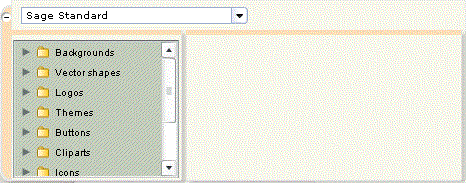
A library of graphic objects

See the help site: Help / help site on the varied toolbar.
A treatment area of layers

Allows you to see the background, modify, resize it or not.
Close
Fields
The following fields are present on this tab :
Block number 1
| Module belonging to the setup. This field is used to specify whether the screen has to be created in the folder database. It is specified when the module linked to the screen is active in the folder. |
Block number 2
|
Close
Design and use tips
- When entering titles, you must start in the middle of the former text, not at the first character, in order to maintain the formatting.
- Group up the objects to move in order to maintain the page layout.
- A text area, for example 'Follow the guide', can be reserved for a brief explanation of the processes and related functions.
Notes
It is possible to define additional picture libraries on the application server, to have specific pictures such as logos, photos, special schemes, for example. It is described in a technical, annex documentation .
